The Art of Effective Learning Content Design: A Focus on Textual Elements

In the realm of education, where knowledge transfer is paramount, the design of learning content plays a pivotal role. Effective design not only enhances the aesthetic appeal of educational materials, but also significantly impacts their effectiveness in conveying information and facilitating learning. Among the various components that contribute to good design, the simple displaying of text and the strategic use of colours deserve particular attention.
The judicious use of text is a cornerstone of effective learning content. Clear and concise language, free from jargon and ambiguity, ensures that learners can easily grasp the intended meaning. Additionally, the appropriate font choice and size are essential for readability. A font that is too small or too ornate can strain the eyes and hinder comprehension. Conversely, a font that is too large or too plain can make the content appear monotonous and unengaging. The use of headings, subheadings, and bullet points can also enhance readability by breaking up large blocks of text and providing visual cues that guide the reader’s attention.
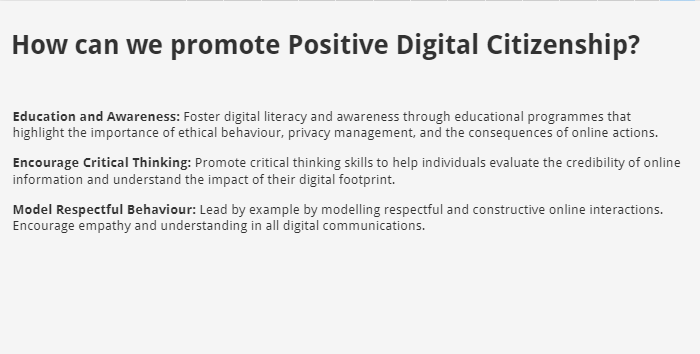
Learning Content example
Here is an example of how simple text might be presented more interesting and better prepared for the learners. This example origins from a training course developed in the frame of an Erasmus+ project. During the translation process of content created by partners, we tried to enhance the layout to a more appealing, visible design.
Colour, when used strategically, can significantly enhance the effectiveness of learning content. Colours can evoke emotions, draw attention, and organize information. For instance, using contrasting colours for headings and body text can improve readability. Colours can also be used to highlight important information or to differentiate between different categories of content. However, it is crucial to use colours judiciously to avoid overwhelming the learner with visual clutter. A limited colour palette can create a more cohesive and visually appealing design.
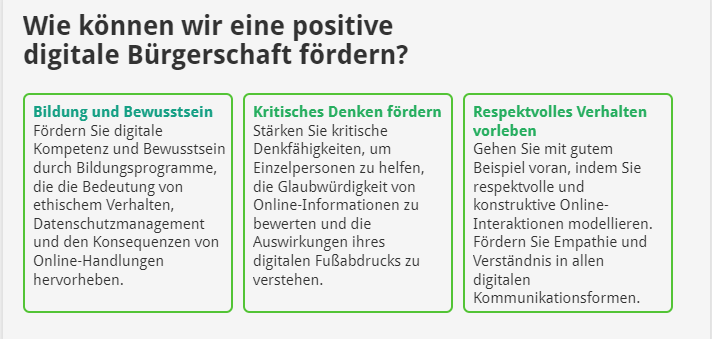
Possible amendments using text and colours
Effective formatting can significantly enhance the readability and comprehension of learning content. By using headings, subheadings, and bullet points, text can be broken down into smaller, more digestible chunks. This visual organization helps learners navigate the material more easily and identify key points. Additionally, consistent formatting throughout the content creates a sense of structure and coherence, making it easier for learners to follow the flow of information and understand the relationships between different concepts.